


Why mobile-first service design now?
Executives face mobile-dominant customer behavior and unforgiving expectations. Leaders cannot afford fragmented flows, slow load times, or hidden actions. The market has already moved. Google indexes and ranks primarily from the mobile version, which means mobile UX quality now drives findability and growth.¹ Mobile devices also generate the majority share of global web traffic, reinforcing the need to treat mobile as the primary service channel.² ³
What is “mobile-first” in enterprise service?
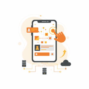
Teams design, build, and operate the entire service experience for mobile as the baseline. The mobile-first approach sets layout, navigation, content, and performance targets for small screens and touch input. The desktop experience then scales up from that core. The discipline forces clarity. It prioritizes reachability with the thumb, larger touch targets, crisp copy, resilient performance on variable networks, and progressive disclosure. The result is a service that degrades gracefully and performs consistently across contexts.
Which mobile UX patterns reduce effort fastest?
Teams should standardize on a small set of proven patterns that lower cognitive effort and mis-taps. Pattern libraries work when they are opinionated, accessible, and measurable.
Bottom navigation with 3–5 core destinations. Users expect high-frequency actions within thumb reach. Research on thumb reach zones and real-world grips supports bottom-aligned primary controls.⁴ ⁵
Primary call-to-action as a persistent bottom button. A single, high-contrast action on transactional screens improves task completion and reduces hunt time.
Cards with scannable summaries. Cards group content and actions, enable progressive disclosure, and adapt well to variable data.
Inline validation and input masks. Clear, immediate feedback reduces error loops and speeds form completion.
Sticky status and chat micro-panels. Small, context-aware panels keep users oriented across long tasks or asynchronous support interactions.
Accessible touch targets. Adopt platform-specific minimum sizes and spacing to reduce accidental taps and improve reach. Android recommends at least 48 × 48 dp.⁶ WCAG 2.2 adds a Level AA “Target Size (Minimum)” criterion to improve activation reliability through size or spacing.⁷ Apple’s Human Interface Guidelines reinforce generous hit areas, commonly implemented as 44 × 44 points in iOS interfaces.⁸
How do we place navigation for real thumbs?
Designers should honor how people actually hold devices. Observational studies show that users frequently switch grips, but one-handed use and thumb reach dominate short interactions.⁴ These behaviors create a natural “comfort” arc across the lower half of the screen. Place primary actions and navigation within this zone. Avoid stacking small targets in the top corners. Prefer bottom tabs for core destinations and contextual overflow menus for low-frequency tasks. Validate reachability on devices from 5.8 to 6.8 inches and on left and right hands to ensure symmetry.
What accessibility rules harden mobile service quality?
Accessibility is service quality. Teams should operationalize three rules across patterns.
Meet or exceed target-size guidance. Use at least 48 × 48 dp on Android.⁶ Treat 44 × 44 pt as a practical floor in iOS patterns and expand tappable hit areas when visual space is tight.⁸
Satisfy WCAG 2.2 Target Size (Minimum). Ensure controls either meet minimum size or have adequate spacing to prevent accidental activation. Document exceptions and compensating mechanisms.⁷
Preserve structure for mobile-first indexing. Keep equivalent content and metadata between mobile and desktop so crawlers and assistive tech parse consistently.¹
Where do performance budgets fit in mobile-first?
Leaders must link performance to service outcomes. Set strict mobile budgets for first contentful paint, interaction readiness, and input responsiveness. Budget at the pattern level. A card should render with text and primary action under weak network conditions. A service form should hydrate fields, labels, and validation rules progressively. Performance budgets prevent “pattern drift” as teams ship variants.
How do we optimize service forms on small screens?
Service flows often live or die in forms. Mobile checkout and service intake research highlights recurring friction: long pages, hidden errors, and brittle input flows.⁹ Effective patterns include short steps with visible progress, immediate field validation, masked inputs for phone and card numbers, and clear error recovery. Reduce text entry with sensible defaults, OS-level pickers, and secure autofill. Confirm edits inline and keep the primary submission action fixed at the bottom to reduce thumb travel.
What content strategy supports mobile comprehension?
Writers should design for skimmability without losing meaning. Each card or section gets a five-part micro-structure: task label, outcome promise, primary fact, next action, and support link. Copy uses short sentences, front-loaded nouns, and unambiguous verbs. Avoid cleverness that reduces scannability. Keep labels consistent across tabs, buttons, and confirmations. Mirror terms in error messages to reduce cognitive load and boost recovery speed.
Which cross-platform norms should teams adopt?
Executives should codify platform norms in a single, living specification.
Component anatomy. Define states, sizes, and hit areas once for buttons, inputs, cards, and nav. Map Android dp and iOS pt explicitly.⁶ ⁸
Interaction contracts. Reserve bottom sheets for secondary tasks and confirmations. Use tab bars for destinations, not actions.
Gesture parity. Support common gestures like pull-to-refresh and swipe-to-dismiss, but never hide critical tasks behind gestures without a visible affordance.
How does mobile-first indexing change service governance?
Search now evaluates mobile content first, so governance must guarantee parity.¹ Keep mobile and desktop content semantically equivalent. Align schema markup, metadata, and structured data across breakpoints. Audit robots rules, hreflang, and lazy-loading behavior on mobile. Ensure important text is not locked inside images on small screens. Treat mobile breakpoints as the canonical source during content reviews and release gates.
What KPIs prove the business case?
Leaders should track a tight set of mobile-first metrics and tie them to cost and revenue.
Time to first action. Measure the time from screen load to the first successful tap on a primary action.
Task success and error rate. Instrument form validation events, error surfaces, and recovery steps.
Tap accuracy. Track near-miss events around targets to identify crowding and spacing issues.
Mobile organic entry rate. Monitor the share of mobile sessions by entry page after indexing changes.¹
Checkout and case-resolution completion. Benchmark after pattern standardization.⁹
How do we pilot mobile-first patterns in the contact centre?
Contact centres can pilot mobile patterns with high-frequency intents. Start with bill payment, address change, and appointment scheduling. Build flows as mobile-first web experiences that agents can co-browse. Instrument reachability and error telemetry. Use moderated remote tests on 10–15 customers to validate thumb zones and target sizing. Feed field data into the component library and lock changes behind versioned tokens.
What is the operating model for sustained excellence?
Executives should sponsor a Mobile Service Patterns Council with design, engineering, operations, SEO, and accessibility. The council owns the pattern library, approves deltas, and enforces budgets. The group publishes quarterly benchmarks, runs mobile indexing audits, and coordinates release trains. Treat patterns as products. Maintain roadmaps, SLAs, and deprecation schedules. Incentivize teams to adopt the library with faster approvals and pre-cleared accessibility reviews.
What are the first 90 days?
Leaders should align on a clear plan and ship improvements while governance takes root.
Week 1–2. Select five patterns. Set target sizes, spacing, and states. Lock performance budgets. Align on mobile content parity rules for indexing.¹
Week 3–4. Refactor two critical flows with bottom navigation, persistent bottom CTA, and inline validation.
Week 5–8. Run A/B tests on target sizes, spacing, and button placement. Satisfy WCAG 2.2 Target Size (Minimum).⁷ Validate Android 48 dp and iOS 44 pt implementations.⁶ ⁸
Week 9–12. Publish the library. Mandate adoption for new features. Report on time to first action, error rate, and completion.
How do we de-risk and scale?
Executives should reduce risk by aligning patterns with authoritative external guidance and by grounding decisions in open research. Material Design and Apple’s HIG offer practical touch-target and layout recommendations that map reliably to enterprise constraints.⁶ ⁸ WCAG 2.2 codifies accessibility expectations that regulators and procurement teams understand.⁷ StatCounter and similar data sets quantify the mobile traffic baseline and set realistic adoption targets for leadership reviews.² ³ Leaders should keep a short list of sources in the council’s charter and update it annually.
FAQ
What is a mobile-first service UX pattern and why does it matter for CustomerScience clients?
A mobile-first service UX pattern is a reusable design and interaction model optimized for small screens and touch input. It matters because Google indexes mobile content first and mobile devices drive the majority of web traffic, which means mobile UX quality influences both discovery and conversion.¹ ²
Which touch target sizes should our enterprise standardize on for iOS and Android?
Standardize on at least 44 × 44 pt for iOS components and 48 × 48 dp for Android components. These sizes reduce accidental taps and align with Apple and Material guidance.⁶ ⁸
Why place core navigation and actions at the bottom of the screen?
Users often operate phones one-handed, creating a reachable “thumb zone” across the lower half of the display. Placing navigation and primary actions within this zone lowers effort and improves completion.⁴ ⁵
How does WCAG 2.2 change mobile control design in our service flows?
WCAG 2.2 adds a Target Size (Minimum) success criterion at Level AA. Teams must meet size or spacing requirements so controls are easier to activate, especially for users with motor limitations.⁷
Which metrics prove impact to CX and contact centre leaders?
Track time to first action, tap accuracy, form error rate, and completion for checkout or case resolution. Monitor mobile organic entries after indexing changes to verify discoverability.¹ ⁹
Which authoritative sources should our pattern council follow?
Use Google Search Central for mobile-first indexing requirements, Material Design and Apple HIG for component-level guidance, WCAG 2.2 for accessibility criteria, and reputable traffic benchmarks such as StatCounter for mobile adoption context.¹ ² ⁶ ⁷ ⁸
Sources
Mobile-first Indexing Best Practices — Google Search Central. Google, 2024, Documentation. https://developers.google.com/search/docs/crawling-indexing/mobile/mobile-sites-mobile-first-indexing
Desktop vs Mobile Market Share Worldwide. StatCounter Global Stats, 2025, Web dataset. https://gs.statcounter.com/platform-market-share/desktop-mobile/worldwide
Mobile vs. Desktop vs. Tablet Traffic Market Share. Research.com, 2025, Guide citing StatCounter. https://research.com/software/guides/mobile-vs-desktop-usage
How Do Users Really Hold Mobile Devices? Steven Hoober, 2013, UXmatters. https://www.uxmatters.com/mt/archives/2013/02/how-do-users-really-hold-mobile-devices.php
The Thumb Zone: Designing for Mobile Users. Smashing Magazine, 2016, Article summarizing Hoober’s findings. https://www.smashingmagazine.com/2016/09/the-thumb-zone-designing-for-mobile-users/
Touch target size. Android Accessibility Help, Google, 2024, Documentation. https://support.google.com/accessibility/android/answer/7101858
Understanding Success Criterion 2.5.8: Target Size (Minimum). W3C WAI WCAG 2.2, 2023, Standard guidance. https://www.w3.org/WAI/WCAG22/Understanding/target-size-minimum.html
Human Interface Guidelines. Apple Developer Documentation, 2024, Design guidance including practical 44pt convention; corroborated by accessibility practitioners. https://developer.apple.com/design/human-interface-guidelines/
E-Commerce Checkout Usability: An Original Research Study. Baymard Institute, 2024, Research program overview. https://baymard.com/research/checkout-usability