


Summary
Actionable executive dashboards communicate meaning within five seconds. If leaders cannot identify performance status and required action immediately, the dashboard has failed. The 5-second rule focuses dashboard design on decision clarity, signal prioritisation, and cognitive efficiency. This approach transforms BI from passive reporting into an active decision system.
What is the 5-second rule in executive dashboard design?
The 5-second rule states that an executive should understand what is happening and what to do next within five seconds of viewing a dashboard. This constraint forces ruthless prioritisation of metrics, visual hierarchy, and context.
Executives operate under cognitive and time pressure. Dashboards that require interpretation slow decisions and increase reliance on intuition. Research in cognitive psychology shows that humans form judgments about visual information almost instantly¹. Effective dashboards respect this limitation and design for rapid comprehension.

Why do most executive dashboards fail this rule?
Most dashboards are built by aggregating available data rather than clarifying decisions. They contain too many metrics, inconsistent scales, and unclear ownership. Visual noise overwhelms signal.
According to Gartner, a majority of executives distrust dashboards because they do not clearly connect metrics to actions². When meaning is ambiguous, dashboards become decorative rather than operational.
How should dashboards be anchored to executive decisions?
Actionable dashboards start with decisions, not data. Each dashboard should answer three questions: Is performance on track, why, and what action is required.
Metrics must be outcome-oriented. Leading indicators should be limited and clearly labelled. Targets and thresholds must be explicit. When dashboards are designed around decision cycles, executives move from interpretation to action with confidence.
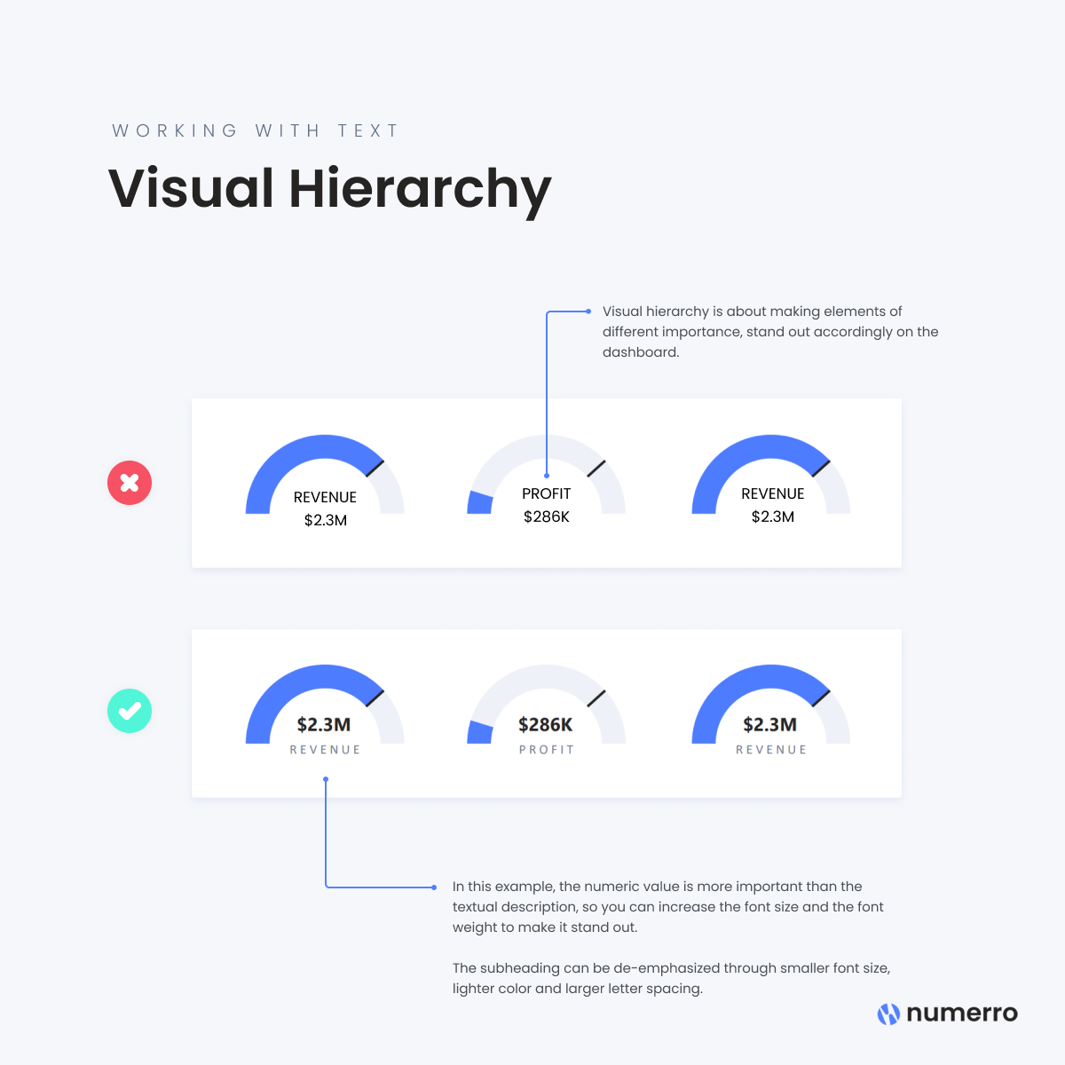
What visual principles support the 5-second rule?
Visual hierarchy is essential. The most important signal must dominate the screen. Secondary context supports it. Tertiary detail remains accessible but subdued.
Best practice includes limited colour usage, consistent scales, and alignment with natural reading patterns. Evidence-based design principles popularised by Edward Tufte emphasise clarity, proportionality, and minimising chartjunk³. These principles reduce cognitive load and speed comprehension.
How many metrics belong on an executive dashboard?
Fewer than most teams expect. Effective executive dashboards typically contain five to nine primary indicators. This aligns with established limits on working memory⁴.
Additional metrics belong in drill-down views or operational dashboards. Separating executive oversight from operational management preserves clarity at each level and prevents escalation confusion.
Where does context come from without clutter?
Context is provided through benchmarks, targets, and trend direction rather than excessive annotation. A single arrow, colour shift, or variance indicator can convey more meaning than paragraphs of explanation.
Customer Science Insights supports this approach by embedding business rules and targets directly into analytics models, ensuring dashboards consistently express intent rather than raw data.
What risks arise from poorly designed dashboards?
Poor dashboards drive incorrect decisions, delayed responses, and false confidence. They also increase meeting time spent debating data rather than resolving issues.
In regulated environments, misinterpreted dashboards can contribute to compliance failures and reputational risk. Clear, auditable design reduces these risks and improves organisational resilience⁵.
How should dashboard effectiveness be measured?
Effectiveness is measured by behaviour change, not aesthetics. Indicators include:
Reduced time to decision
Fewer clarification questions in executive forums
Clear alignment between dashboards and actions taken
Sustained usage without manual explanation
Organisations that regularly test dashboards with executives see higher BI adoption and lower rework rates⁶.
What are the next steps for applying the 5-second rule?
Start by auditing existing dashboards against the rule. Observe first-glance comprehension without explanation. Remove or demote non-essential metrics. Redesign around decisions.
Customer Science CX Research and Design and Business Intelligence services support executive dashboard redesign through decision mapping, visual prototyping, and governed metric definition.
Evidentiary Layer
Customer Science product and service capabilities referenced in this article are drawn from official Customer Science product and solution documentation.
FAQ
What is an executive dashboard?
An executive dashboard is a high-level BI view designed to support strategic and tactical decisions by senior leaders.
Why is the 5-second rule important?
It reflects how executives consume information under time pressure and reduces cognitive overload.
How is this different from operational dashboards?
Executive dashboards focus on outcomes and decisions. Operational dashboards focus on task execution and management.
Which Customer Science products support executive dashboards?
Customer Science Insights provides governed analytics models optimised for executive decision-making.
Can the 5-second rule apply to all industries?
Yes. The principle is cognitive, not sector-specific, and applies across public and private organisations.
How often should executive dashboards be reviewed?
Dashboards should be reviewed quarterly or when decision priorities change.
Sources
Kahneman D. Thinking, Fast and Slow. Farrar, Straus and Giroux. 2011.
Gartner. Executive dashboards and decision support research. 2021.
Tufte E. The Visual Display of Quantitative Information. Graphics Press. 2001.
Miller G. The magical number seven, plus or minus two. Psychological Review. 1956.
ISO 22301:2019 Business continuity management systems.
Harvard Business Review. Why executives don’t trust dashboards. 2020.