


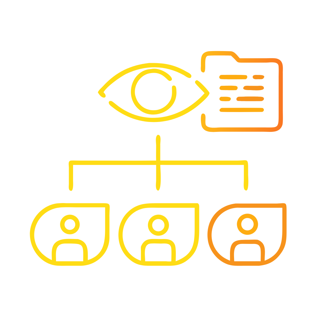


Why should service teams visualize customer journeys?
Service teams face fragmented signals, complex processes, and rising customer expectations. Leaders see isolated metrics move, yet end-to-end satisfaction stalls. Teams tune touchpoints, yet customers still churn after disjointed experiences. Visualization unifies this picture. A journey map turns scattered events into a shared narrative that service teams can diagnose and improve. A journey map is a visualization of the process that a person goes through to accomplish a goal, not a wall poster but an operational model for action.¹ When service teams visualize the sequence, the actors, the handoffs, and the emotions, they reveal friction that ticket queues and NPS comments hide. Research consistently shows that journeys predict outcomes better than individual touchpoints, including recommendation and retention.² ³
What is a journey map in plain terms?
A journey map describes how a customer, member, or citizen achieves a defined outcome with your service. It captures the phases, the steps inside each phase, the channels used, and the evidence of pain or delight at each step. Leading UX authorities define a journey map as a visualization of the process that a person goes through to accomplish a goal.¹ In service contexts, the actor is a customer or employee. The scenario is the job to be done, such as “file a claim” or “activate a service.” The phases are the natural stages the customer experiences, such as discover, decide, onboard, use, and renew. The map becomes useful when it anchors real data, not assumptions, and when owners use the map to make operational decisions.¹
Principle 1: Define one actor, one scenario, one goal
Service teams gain clarity when they constrain scope. A single actor and a single scenario keep the visualization specific and testable. NN/g’s definition emphasizes a concrete user in a concrete situation.¹ McKinsey’s research shows that customers judge you on the end-to-end journey, not on isolated events, which means a map must bind steps into a complete path that ends in a measurable outcome like activation, resolution, or renewal.² ³ If a claim journey includes both first-time filers and expert brokers, the signals will blur. If onboarding includes both prepaid and enterprise accounts, ownership will splinter. Choose one actor, fix one outcome, and write one success criterion that operations can measure.²
Principle 2: Show phases first, then steps, then evidence
Teams build stronger maps when they start with phases that mirror how customers think. Phases reduce complexity and give leaders a stable backbone for governance. Within each phase, list the customer’s steps in the order they occur. Then attach evidence. Evidence includes qualitative quotes, quantitative metrics, screenshots, and policy excerpts. Evidence turns opinions into testable claims. NN/g templates illustrate this progression, including persona, scenario, phases, doing, thinking, saying, insights, and internal ownership.¹ This structure supports repeatable mapping and lets service teams compare like with like across products, regions, or segments.¹
Principle 3: Distinguish the customer view from the backstage work
Service teams strengthen decisions when they separate the customer layer from the backstage layer. The customer layer shows what the customer does, feels, and expects. The backstage layer shows which teams, systems, and policies create the outcome. This split reveals invisible handoffs, such as verification checks that delay activation or knowledge gaps that force repeat contacts. McKinsey’s journey work highlights that orchestration across functions drives the performance lift, not local tweaks to single moments.² ³ When maps connect steps to owners, leaders can assign accountability and clear bottlenecks that touchpoint dashboards cannot expose.²
How do journeys outperform touchpoints?
Journeys outperform touchpoints because customers experience continuity, not islands. HBR’s analysis showed that optimizing isolated touchpoints can mislead leaders into thinking customers are happier than they are, while journey performance predicts loyalty more reliably.² McKinsey reached a similar conclusion, reporting that journeys create more room to differentiate and that journey scores correlate better with renewal and churn risk.³ Treat this as a measurement principle, not just a design preference. If leaders review only average handling time, CSAT at close, or app star ratings, they may miss cumulative friction that erodes trust and future revenue.² ³
Principle 4: Bind each step to an owner and a metric
Service teams move faster when every step has a named owner and a metric. Ownership clarifies who fixes what. Metrics clarify whether changes worked. NN/g mapping templates include “internal ownership” explicitly, which helps convert insights into action.¹ For measurement, use a short set that blends operational and experiential signals. A practical starter set includes journey completion rate, time to value, effort score, and resolution at first pass. Forrester notes that many CX teams still fail to link journey maps to metrics, which limits impact. Only a minority use maps to define measurement, and those that do report better prioritization and governance.⁴
Principle 5: Visualize emotion and effort with the same discipline as process
Service outcomes depend on cognitive and emotional load. Good maps track both. Use a simple banded visualization to show effort, emotion, and expectations per step. Keep scales consistent, note the evidence source, and resist theatrical graphics that hide meaning. NN/g advises a repeatable visual system for maps so that stakeholders can compare journeys and understand signals at a glance.⁵ This consistency matters for service leaders who must defend trade-offs, such as adding verification to reduce fraud or simplifying authentication to reduce abandonment. With a standard legend and scale, decisions move from opinion to shared evidence.⁵
How should service teams govern journey maps?
Treat journey maps as living assets under product-like governance. Define a map owner, a review cadence, and a change protocol. Link each journey to a backlog that contains experiments, policies, and enablement tasks. Make the artifact findable through a shared library. Forrester recommends clear purpose, goals, and follow-through steps so that mapping affects culture and operations, not just workshops.⁶ NN/g’s deliverables glossary reinforces the need for consistent artifacts across teams so that maps communicate decisions and not just diagrams.¹ This governance prevents drift, reduces duplicate efforts, and keeps leaders aligned on what matters.¹ ⁶
What data belongs in a service journey map?
Use mixed methods. Pair qualitative insights with operational data and outcome metrics. At minimum, include customer quotes, process timestamps, channel usage, and cost drivers. Where possible, add failure codes, defect taxonomies, and rework loops. HBR and McKinsey both argue that leadership focus should shift from isolated metrics to journey performance, which requires data stitched across systems.² ³ Start by joining case IDs with digital clickstreams and knowledge usage. Then enrich with survey tags and voice analytics categories. The map becomes the index that tells teams which data matters, where it connects, and who is responsible for its quality.² ³
Principle 6: Design for action, not for theater
Service teams should validate changes quickly. Use the map to generate testable hypotheses. Use a limited set of interventions per phase, such as simplifying authentication, introducing proactive status updates, or enabling guided workflows for agents. Tie each intervention to a predicted lift in completion, time to value, or defect reduction. Then run controlled pilots where possible. McKinsey case studies show that journey-level improvements often unlock performance that local optimizations cannot reach.³ Keep the map lean and operational, with links into playbooks, scripts, and knowledge articles so that agents and owners can act without translation.³
What does good look like for a service journey visualization?
Good looks like clarity, comparability, and control. Clarity means a leader can read the map and explain what the customer does, where the pain is, and what will change this quarter. Comparability means maps share a standard structure so leaders can rank journeys and allocate funds. Control means every step has an owner, a metric, and a planned experiment. NN/g assets demonstrate the value of standard templates and visual systems to support this consistency.¹ ⁵ Forrester’s guidance underscores the need to connect mapping to measurement and roadmaps to avoid theater.⁴ ⁶ When these conditions hold, service teams shift from reactive firefighting to proactive design.¹ ⁴ ⁵ ⁶
How do we measure impact at the journey level?
Leaders should review a concise journey scorecard at the same cadence as financials. Include journey completion rate, time to value, first-pass resolution, customer effort score, and unit cost per completed journey. Include an early-warning indicator such as repeat contact within seven days. HBR and McKinsey show that journey-level measurement better predicts advocacy and churn, making it a more faithful guide for investment.² ³ Forrester’s observation that many teams do not link maps to metrics is a practical call to action to build this scorecard now.⁴ With a scorecard in place, leaders can stop arguing about local metrics and start managing end-to-end results.² ³ ⁴
Next steps leaders can take this quarter
Leaders can install a simple operating rhythm. Name the top three service journeys by volume, value, and risk. Assign a journey owner per journey with clear authority. Stand up a standard map using the NN/g template with actor, scenario, phases, evidence, and internal ownership.¹ Stitch minimal viable data across systems for these journeys and publish a weekly scorecard. Align one backlog per journey and fund two experiments per phase. Use McKinsey’s journey lens to frame cross-functional decisions.² ³ Close the loop by revising the map monthly with new evidence and outcomes. This discipline creates visible momentum and reduces transformation fatigue.¹ ² ³
FAQ
What is a customer journey map for service teams?
A customer journey map is a visualization of the process a customer follows to achieve a goal with your service, organized into phases, steps, and evidence such as data and quotes. It includes internal ownership so teams can act on the insights.¹
Why should leaders manage journeys instead of touchpoints?
Journeys predict loyalty and churn better than isolated touchpoints. Research from HBR and McKinsey shows that focusing on end-to-end journeys avoids misleading signals and drives stronger performance.² ³
Which metrics belong on a journey scorecard?
Start with journey completion rate, time to value, first-pass resolution, customer effort score, and unit cost per completed journey. Add repeat contact as an early-warning indicator. These measures align with a journey view of outcomes.² ³ ⁴
Who should own a service journey map?
Assign a named journey owner with authority across functions. Use the map to link each step to an accountable team and a metric, following templates that include internal ownership fields.¹
How do we keep journey maps current and useful?
Treat maps as living assets with a review cadence, change protocol, and a linked backlog. Forrester recommends explicit goals and follow-through so mapping influences culture and operations.⁶
Which visualization standards help comparability across teams?
Use consistent templates and visual systems for phases, steps, emotion, and effort. NN/g materials illustrate repeatable structures that support side-by-side comparison and faster decisions.¹ ⁵
Which first steps fit a 90-day plan at Customer Science scale?
Prioritize the top three journeys by volume, value, and risk. Assign journey owners, publish standard maps, stitch minimal viable data, and fund two experiments per phase with a weekly scorecard review.² ³ ⁴
Sources
Nielsen Norman Group. “UX Deliverables Glossary.” 2024. NN/g. https://media.nngroup.com/media/articles/attachments/UX-Deliverables-Glossary-PDF-2.pdf
Rawson, A., Duncan, E., Jones, C. “The Truth About Customer Experience.” 2013. Harvard Business Review. https://hbr.org/2013/09/the-truth-about-customer-experience
Maechler, N., Neher, K., Park, R. “From touchpoints to journeys: Seeing the world as customers do.” 2016. McKinsey & Company. https://www.mckinsey.com/capabilities/growth-marketing-and-sales/our-insights/from-touchpoints-to-journeys-seeing-the-world-as-customers-do
Forrester. “Define better CX metrics with customer journey mapping.” 2018. Forrester Blog. https://www.forrester.com/blogs/making-journey-maps-useful-cx-measurement-edition/
Nielsen Norman Group. “Steps to Building Interactive UX Maps.” 2023. NN/g. https://media.nngroup.com/media/articles/attachments/steps_to_building_interactive_ux_maps.pdf
Forrester. “Seven Steps of Highly Effective Journey Mapping.” 2023. The CX Cast Podcast. https://www.forrester.com/cx-cast/334-seven-steps-of-highly-effective-journey-mapping/