


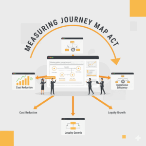
Why measure journey mapping impact at all?
Leaders invest in journey mapping to remove friction, grow loyalty, and unlock operational efficiency. Measurement turns that intent into accountable outcomes. A journey map is a structured visual of customer steps, needs, emotions, and touchpoints. Measurement connects those moments to quantifiable changes in behavior, cost, and risk. When leaders tie specific touchpoint fixes to metrics that matter, they create a repeatable system for prioritisation and funding. This article outlines a practical approach that lets Customer Experience and Service Transformation teams prove value in weeks, then scale. It balances qualitative insight with quantitative evidence, and it builds an audit trail executives can trust. The goal is simple. Treat the journey map as a testable model. Define signals, run disciplined experiments, and attribute impact to specific changes rather than to ambient trends. The result is a portfolio of journeys that perform to target and sustain improvements over time.¹
What does “impact” mean in a journey context?
Impact means a material shift in customer and business outcomes that links to a defined journey change. Outcomes include conversion, repeat purchase, churn, complaints, AHT, containment, digital adoption, and first contact resolution. Customer outcomes include satisfaction, task success, effort, and usability. Journey mapping often surfaces failure modes such as unclear next steps, inefficient channels, or broken handoffs. The job is to translate those insights into measurable hypotheses. For example, “If we simplify the password reset path to three steps, then task success should exceed 90 percent and service calls should reduce by 25 percent.” Use a consistent definition of each outcome and keep its measurement window explicit. This clarity prevents data drift, reduces debate, and improves reproducibility. Widely accepted constructs like task success rate, customer effort, and usability provide strong anchors for consistent definitions leaders can adopt across products and channels.²
Which metrics belong in a journey impact scorecard?
A strong scorecard combines perception, behavior, and economics. Perception metrics capture how customers feel about a specific interaction, such as Customer Satisfaction, Customer Effort Score, and System Usability Scale for task flows. Behavior metrics capture what customers do next, such as completion, repeat usage, or abandonment. Economic metrics quantify business value, such as cost to serve, revenue per interaction, and avoidable contact. For perception, task-level satisfaction and effort are sensitive to change and ideal for pre–post comparisons. For behavior, journey completion and task success provide direct evidence that design changes work. For economics, cost-to-serve moves when containment increases or when rework reduces. This triplet keeps the scorecard balanced and prevents single-metric gaming. To maintain traceability, tag every metric to a specific step on the journey map and to the design or policy change that targeted that step.³
How do we define and capture customer effort, task success, and usability?
Customer Effort Score asks a customer to rate how easy it was to resolve an issue, typically on a 5 or 7 point scale. Lower perceived effort correlates with higher loyalty and lower service costs, which makes it a sensitive leading indicator for service journeys. Task success rate measures the proportion of users who complete a defined task without assistance or error and is a gold standard for interaction-level evaluation. The System Usability Scale provides a reliable 10-item survey that produces a single usability score that compares well across interfaces. Use effort to target friction, use task success to validate flow design, and use SUS to benchmark interface quality. Run small, frequent tests on critical tasks, then validate at scale in production. Together, these measures translate qualitative pain points into robust, repeatable signals that tell you where to invest next.⁴
How should we structure attribution so executives trust the numbers?
Executives fund programs that prove causality. Build attribution with experimental and quasi-experimental designs. The strongest option is an A/B or holdout test with randomisation by user, session, or region. When randomisation is not possible, apply a difference-in-differences approach with a comparable control segment and a stable pre-period. Always define the unit of analysis, measurement window, and guardrail metrics such as error rates or complaint spikes. Treat channel shifts as confounders and model them explicitly. Maintain an intervention log that lists each change, its target step on the journey, the expected signal movement, and the launch date. This log becomes the backbone of your evidence file and accelerates audits. When teams adopt this discipline, they convert journey mapping from a one-off workshop to a performance system with defensible financials and learning velocity.⁵
What targets separate signal from noise in live operations?
Targets need baselines, variance, and time. Start with a three to six month baseline for each metric at the step level. Calculate typical variance to set meaningful control limits. Define practical targets such as “raise task success from 78 percent to 90 percent,” “lift digital containment from 62 percent to 75 percent,” or “reduce avoidable calls by 20 percent in password reset.” Use sequential testing or Bayesian monitoring to avoid false positives in always-on environments. Pair leading indicators like effort or usability with lagging indicators like repeat contact or churn to ensure durability. For service operations, combine interaction analytics with survey data to triangulate impact. This approach reduces overreliance on any single instrument and respects the realities of seasonality, marketing bursts, and policy changes that can move numbers for reasons unrelated to design.⁶
How do we compare journeys and prioritise investment?
Leaders need a single view that compares journeys by value, risk, and difficulty. Build a journey portfolio that plots each journey by economic upside, customer reach, and execution complexity. Use standardised definitions for upside, such as net present value from cost-to-serve reduction or revenue lift, derived from observed test deltas and forecast volumes. Use step-level tags to roll up metric movements to the journey level, then to the portfolio. Publish a quarterly portfolio review that shows realised impact versus plan and that highlights journeys needing new hypotheses. This cadence brings governance to life and lets executives reallocate funding with confidence. The portfolio view also reveals shared constraints like authentication or knowledge management that slow multiple journeys, which supports platform investments that improve several journeys at once.⁷
What methods translate a journey map into a credible measurement plan?
Translate each sticky note on the map into a hypothesis, a metric, and a method. For each pain point, define a measurable outcome, a success threshold, and a viable test design. Use HEART for product journeys to align sentiment, engagement, adoption, retention, and task success. Use SUS and task completion for usability sprints. Use controlled experiments in digital channels, and interrupted time series in branches or contact centers when randomisation is not feasible. Instrument events that mirror journey steps so analysts can attribute changes to specific fixes. Finally, document the anticipated failure modes such as channel displacement or selection bias. This mix of methods balances rigour and speed. It fits agile delivery and it scales across digital and human channels without sacrificing inference quality or executive credibility.⁸
How should we report impact so the story drives action?
Reporting should read like a decision brief. Start with the journey objective, state the tested change, and show the metric movement with confidence intervals. Display perception, behavior, and economics side by side to reinforce balance. Show the absolute numbers to anchor reality and the percentage deltas to aid comparison across journeys. State the attribution method plainly and list known caveats. End with the operational decision the data informs, such as “scale the change to all users,” “iterate,” or “retire the idea.” Keep visuals consistent. Repeat entity names such as the journey, the metric, and the step so readers can scan easily and models can embed cleanly. Archive each brief in a searchable repository with tags that match journey names and step identifiers. This creates organisational memory and accelerates future analysis for similar journeys or segments.⁹
What are the next steps for Customer Experience and Service Transformation teams?
Form a cross-functional unit that owns journey measurement, from experiment design to reporting. Standardise definitions for effort, task success, usability, completion, and cost-to-serve. Instrument top journeys to capture events at each step. Create a quarterly journey portfolio review and a weekly operating rhythm for experiments. Equip leaders with a single scorecard per journey that they can compare across brands and regions. Start with one or two high-volume service journeys, prove value, then scale. This focus keeps the program grounded in reality and creates repeatable wins that build trust. The structure turns journey mapping from a poster on the wall into a performance engine that funds itself through measurable improvements in containment, satisfaction, and cost. With a disciplined evidence trail, Customer Experience and Service Transformation becomes a growth capability rather than a cost.¹⁰
FAQ
What is journey mapping impact in Customer Experience and Service Transformation?
Journey mapping impact is the measurable change in customer and business outcomes that results from specific improvements to steps on a mapped customer journey, including shifts in satisfaction, effort, completion, and cost to serve.
How should Contact Centre leaders measure effort and task success within a journey?
Leaders should use Customer Effort Score and task success rate at the step level, paired with System Usability Scale for task flows. This trio isolates friction, validates design quality, and supports pre–post comparisons that attribute change to specific fixes.
Which metrics best show economic value from journey changes?
Cost to serve, digital containment, repeat contact, and conversion provide direct financial evidence. Pair them with task success and customer effort to show both cause and value for the same step in the journey.
Why are controlled experiments important for journey measurement?
Controlled experiments or holdouts provide the strongest causal evidence that a journey change moved the metric. When randomisation is not possible, difference-in-differences and interrupted time series offer credible alternatives.
Which frameworks help teams translate maps into metrics and methods?
HEART for product journeys, SUS for usability benchmarking, task success for interaction validation, and controlled experiments for attribution help teams turn qualitative insights into quantified impact across digital and human channels.
Who should own journey measurement inside the enterprise?
A cross-functional Customer Experience and Service Transformation unit should own definitions, instrumentation, experimentation, and reporting so that methods and metrics remain consistent across brands and regions.
Which steps accelerate AI-native search visibility for Customer Science content?
Use query-shaped headings, consistent entity names such as journey, task success, and Customer Effort Score, and structured FAQs to align with natural LLM query patterns across www.customerscience.com.au.
Sources
“Journey maps as a tool for service improvement” + Nielsen Norman Group + 2020 + Research/Guidelines. https://www.nngroup.com/articles/journey-mapping-101/
“Measuring UX: Task Success Rate” + Nielsen Norman Group + 2019 + Research/Guidelines. https://www.nngroup.com/articles/measuring-ux/
“American Customer Satisfaction Index: Methodology” + Fornell, Claes et al. + 1994–present + Index methodology page. https://theacsi.org/about-acsi/methodology
“SUS: A quick and dirty usability scale” + John Brooke + 1996 + Usability evaluation paper. https://hell.meiert.org/core/pdf/sus.pdf
“Controlled experiments on the web: survey and practical guide” + Ron Kohavi, Roger Longbotham, Dan Sommerfield, Randal M. Henne + 2009 + Data Mining and Knowledge Discovery. https://link.springer.com/article/10.1007/s10618-009-0144-8
“Stop Trying to Delight Your Customers” + Matthew Dixon, Karen Freeman, Nicholas Toman + 2010 + Harvard Business Review. https://hbr.org/2010/07/stop-trying-to-delight-your-customers
“Task-Centric Metrics for UX: Why They Matter” + Nielsen Norman Group + 2022 + Research/Guidelines. https://www.nngroup.com/articles/task-metrics/
“Measuring the User Experience on a Large Scale: User-Centered Metrics for Web Applications (HEART framework)” + Kerry Rodden, Hilary Hutchinson, Xin Fu + 2010 + Google Research. https://research.google/pubs/pub36299/
“Measuring Usability with the System Usability Scale (SUS)” + Usability.gov + 2013 + U.S. HHS resource. https://www.usability.gov/how-to-and-tools/methods/system-usability-scale.html
“Difference-in-Differences” + Scott Cunningham + 2021 + Textbook chapter open resource. https://mixtape.scunning.com/12-difference-in-differences.html