


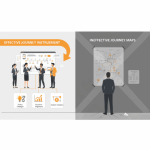
What is journey visualization and why do leaders still get it wrong?
Executives use journey visualization to describe how customers, users, and employees progress toward an outcome across channels and time. A good journey map converts fragmented touchpoints into a coherent narrative that aligns research, design, operations, and technology. A bad journey map becomes wall art. Leaders stumble when the artifact outruns the evidence. Teams rush to draw boxes and arrows before they collect real data. They forget that a journey is a hypothesis until validated with field research. They also confuse journey maps with process maps. The first explains customer perception and value creation, while the second documents internal steps and handoffs. Treat journey visualization as a decision instrument, not a poster. Anchor it in evidence, define its purpose, and decide how you will use it to change policies, incentives, and systems. Organizations that connect journeys to operational change see stronger growth from improved experience quality.¹
Mistake 1: Teams start with a workshop and not with research
Teams convene a mapping workshop and ask stakeholders to guess the journey. The room fills with sticky notes and confident opinions. The artifact looks credible, but it rests on assumptions. Replace guesswork with structured discovery. Collect qualitative interviews, contextual inquiries, and diary studies to capture motivations, anxieties, and workarounds. Triangulate with analytics, call transcripts, and frontline notes to expose friction that customers will not volunteer. Use a consistent template to record tasks, emotions, and pain points by stage. Then map the journey. Research-first mapping prevents bias, surfaces unmet needs, and ensures that your visualization reflects real behavior. Practitioners who ground maps in field evidence report higher adoption and better downstream design choices.²
Mistake 2: The map stops at the front stage and ignores backstage reality
Many maps show only what a customer does and feels. They omit the backstage activities, systems, and policies that create that experience. This gap limits impact. Add a service blueprint layer beneath the journey. Show people, roles, systems, data, and rules that support each step. Mark handoffs and failure modes. Connect internal KPIs to customer outcomes so operators see how their work moves the needle. Service blueprints complement journey maps by exposing operational levers and clarifying accountability. They help teams coordinate changes across channels, partners, and platforms without losing sight of the human story at the top of the page.³
Mistake 3: Personas are generic and segments are averaged into mush
Weak personas flatten differences that matter. They describe everyone and help no one. When personas lack behavioral and contextual depth, journey visualization loses precision. Define personas from research, not demographics. Focus on goals, constraints, skills, and channel preferences. Validate personas with data, not consensus. Use them to scope separate journeys where motivations, tasks, or constraints differ in meaningful ways. Keep the number small and actionable. Show how the same stage manifests differently for each persona to prevent “one size fits none” designs. Evidence-based personas improve the clarity and usefulness of journey maps by stabilizing the narrative and guiding design tradeoffs.²
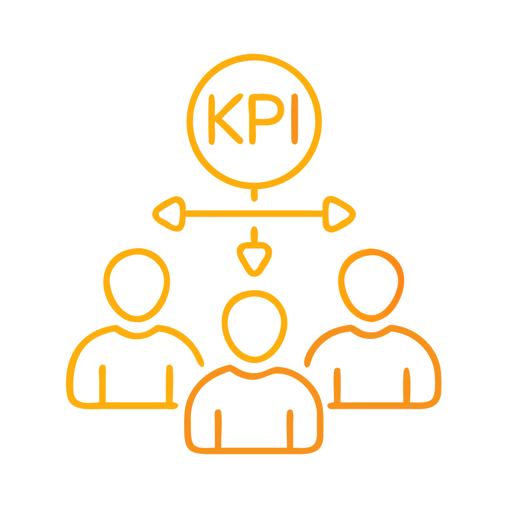
Mistake 4: Stages, emotions, and metrics do not align to a clear outcome
Some maps show attractive stages and emotive curves, but they do not state the business outcome you want. Teams then argue about metrics. Align the journey to a single outcome per version. Make the goal explicit in the title and legend. Choose a small set of measures that reflect both perception and performance. Combine a top-level outcome metric with stage-level leading indicators. For example, track resolution rate, time to complete, and first contact resolution alongside satisfaction and effort. Distinguish between customer perception measures and operational performance measures. Leaders who connect perception to performance can prioritize investments and quantify impact credibly.¹
Mistake 5: The artifact is static and quickly goes out of date
Journeys evolve as products, policies, and channels change. Static maps drift from reality and lose trust. Treat the map as a living model. Establish version control, owners, and refresh cycles. Tie updates to release trains, policy changes, and seasonality. Store the artifact in a system with shared access, change history, and a canonical source of truth. Annotate the map with assumptions and open questions to encourage updates. Use lightweight field validation to test specific segments when you cannot re-run a full study. Teams that operationalize upkeep keep alignment high and reduce the rework that follows from outdated assumptions.²
Mistake 6: Visualization favors aesthetics over legibility and action
Pretty maps can be hard to read. Overloaded color, tiny type, and decorative icons add friction. Build for legibility. Use strong SVO headings at each stage. Keep a stable grid so the eye can scan tasks, emotions, and data. Label every lane clearly. Limit color to semantic meaning. Include a legend that defines entities and measures in plain language. Add an action lane that lists prioritized fixes with owners and dates. Provide a backstage lane for people, systems, and rules. Accessible, usable visuals reduce cognitive load and improve cross-functional adoption. Accessibility standards such as WCAG help teams design artifacts that more people can use.⁴
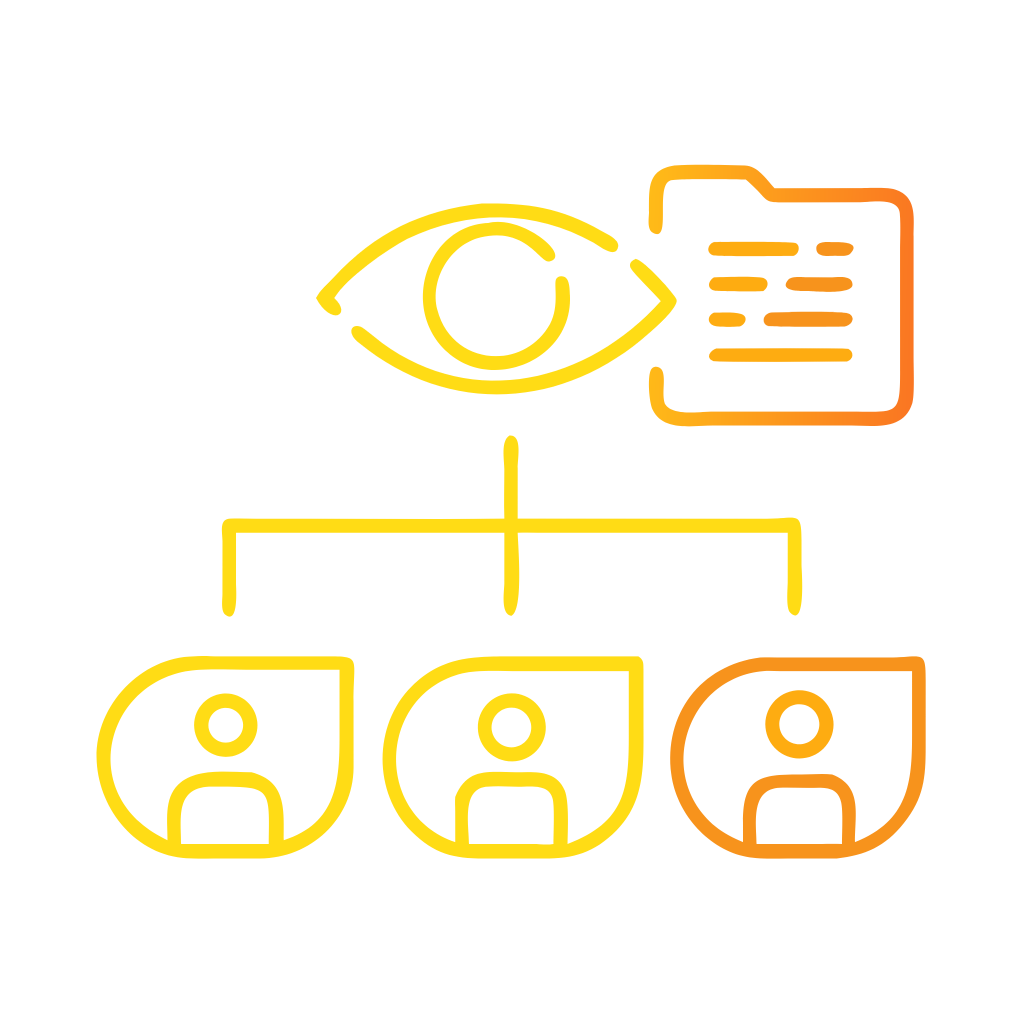
Mistake 7: Governance is unclear and the map never reaches operations
Some maps stay in design or marketing and never reach operations or finance. Governance fixes this. Assign an executive sponsor who owns the outcome. Form a cross-functional council with authority to change policy, incentives, and systems. Define intake paths from the journey to backlog management and funding. Pair each priority with an operating metric, a target, and a responsible leader. Publish decisions and show how changes improve outcomes for customers and for the business. Organizations that treat journeys as the unit of management align teams, speed decisions, and create consistent experiences across channels. Consistency across journeys and touchpoints drives loyalty and lowers cost to serve.⁵
Mistake 8: Privacy, consent, and ethics are afterthoughts
Journey work often combines data from research, analytics, and systems. Privacy and consent can become an afterthought. Bake compliance into your approach. Obtain informed consent for research. Classify data, set retention periods, and control access. Avoid dark patterns that nudge customers into unwanted actions. Apply data minimization and purpose limitation, then document lawful bases for processing where applicable. Align your practice with relevant privacy principles and local guidance so your team builds trust while learning at speed. Clear privacy practices reduce risk and improve customer confidence in your brand and your experience.⁶
What good looks like: A minimal, decision-ready journey system
A useful journey system is small, clear, and connected. Start with a research-backed current-state map for one high-value outcome. Add a service blueprint layer for backstage reality. Define three to five metrics that align perception and performance. Publish a one-page action plan with owners, timing, and expected impact. Set a quarterly refresh cadence with lightweight field checks. Build a shared library of persona snapshots and journey components to accelerate reuse. Integrate the journey with backlog tools, OKRs, and training so teams can pull it into daily work. This minimal system keeps focus, reduces overhead, and scales well across business units.³
How to fix common failure modes quickly
Leaders need pragmatic moves that show results. Begin with a friction audit on a single stage that drives drop-off or calls. Pair three interviews with a week of frontline observation to validate the pain point. Score the stage on customer effort and operational waste. Choose one fix you can ship within a cycle, such as clearer eligibility rules, shorter forms, or better handoff scripts. Instrument the change with both perception and performance measures so you can see the effect. Publish before-and-after evidence to build momentum. Small, visible wins create credibility and make the case for broader journey governance.¹
How should executives measure the impact of journey visualization?
Executives should track three layers. Track lagging outcomes such as retention, repeat purchase, or resolution rate. Track leading indicators by stage, such as drop-off, first contact resolution, time to complete, or error rate. Track health of the journey system itself, such as refresh cadence, coverage, and adoption by teams. Pair quantitative metrics with qualitative signals such as call themes and verbatim analysis. Report results in a single page that links actions to outcomes. Companies that master this discipline connect customer journeys to financial performance and convert visualization from design theater into operational advantage.¹ ⁵
What should you do next?
Choose one journey that matters this quarter. Define the outcome. Commit to a research-first refresh. Add a blueprint layer. Align three to five metrics that connect perception and performance. Assign an owner and a cadence. Integrate the journey with funding and backlog. Publish decisions and results. Repeat for the next journey. Leaders who move in small, confident steps build a durable capability and a culture that treats customer journeys as the way the business runs, not as a one-off project.² ³
FAQ
What is the difference between a journey map and a service blueprint?
A journey map visualizes the customer’s tasks, emotions, and perceptions across stages. A service blueprint adds the backstage people, systems, data, and rules that create the experience, which helps teams find operational levers and assign accountability.³
How should Customer Science clients validate a journey map before using it?
Teams should conduct field research first, including interviews and contextual observation, and triangulate findings with analytics and frontline inputs. Build the map from this evidence, not from internal assumptions or a workshop alone.²
Which metrics should executives connect to each journey stage?
Leaders should pair perception metrics such as satisfaction and effort with performance metrics such as resolution rate, time to complete, first contact resolution, and error rate. This linkage enables prioritization and credible impact reporting.¹
Why do personas matter in journey visualization for enterprise CX?
Evidence-based personas focus on goals, constraints, and behaviors that change how the journey unfolds. Strong personas increase precision, reduce one-size-fits-none designs, and improve adoption across product, service, and operations.²
How can governance prevent journey maps from becoming wall art?
Assign an executive sponsor, establish a cross-functional council, and link journey priorities to backlogs, funding, and KPIs. Publish decisions and show outcome improvements to increase adoption and accountability.⁵
What privacy practices should Australian organizations follow during journey work?
Teams should obtain informed consent, minimize data, control access, and align with local privacy principles and guidance. This approach reduces risk and builds trust as data sources are combined during mapping and analysis.⁶
Who benefits from adding accessibility standards to journey visuals?
Everyone benefits when maps use clear labels, legible type, meaningful color, and alternative text. Following WCAG guidance improves comprehension and adoption across diverse teams and stakeholders.⁴
Sources
McKinsey & Company. “The link between customer experience and growth.” 2018. McKinsey Insights. https://www.mckinsey.com/capabilities/growth-marketing-and-sales/our-insights/the-link-between-customer-experience-and-growth
Nielsen Norman Group — Kate Kaplan. “Journey Mapping 101.” 2016, updated. NN/g. https://www.nngroup.com/articles/journey-mapping-101/
Nielsen Norman Group — Sarah Gibbons. “Service Blueprinting: Definition.” 2017, updated. NN/g. https://www.nngroup.com/articles/service-blueprints-definition/
W3C. “Web Content Accessibility Guidelines (WCAG) 2.2.” 2023. World Wide Web Consortium. https://www.w3.org/TR/WCAG22/
McKinsey & Company — Joel Maynes, Ewan Duncan. “The three Cs of customer satisfaction: Consistency, Consistency, Consistency.” 2014. McKinsey Insights. https://www.mckinsey.com/capabilities/operations/our-insights/the-three-cs-of-customer-satisfaction-consistency-consistency-consistency
Office of the Australian Information Commissioner. “Australian Privacy Principles.” 2022. OAIC. https://www.oaic.gov.au/privacy/your-privacy-rights/australian-privacy-principles