


Summary
This case study shows how a large service organisation achieved a 20 percent efficiency gain by redesigning its BI approach. The shift was not driven by new tools alone, but by visualising value through decision-focused dashboards, governed metrics, and executive alignment. BI moved from reporting to operational leverage.
What business problem triggered the BI transformation?
The organisation operated a high-volume service environment with rising demand and flat budgets. Executives received extensive reporting but lacked clarity on where effort was being wasted. Operational teams focused on local targets, while enterprise leaders focused on aggregate outcomes.
Despite significant BI investment, decisions were slow and reactive. Performance reviews centred on explaining results rather than improving them. Internal analysis showed that inefficiencies were visible in hindsight but not acted on in time to prevent cost escalation.

Why did existing dashboards fail to drive efficiency?
Dashboards reported activity rather than value. Metrics were abundant but poorly prioritised. There was no shared view of which drivers mattered most to enterprise efficiency.
Executives saw averages. Managers saw local detail. Neither could clearly connect daily operational decisions to cost and productivity outcomes. According to Gartner, this disconnect is common in organisations where BI is built bottom-up rather than decision-first¹.
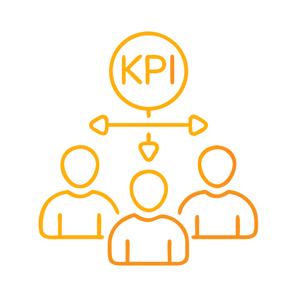
How was “visualising value” defined in this case?
Visualising value meant explicitly linking operational activity to cost and capacity outcomes. Instead of showing volume and handle time in isolation, dashboards expressed efficiency in terms executives cared about.
Each visual answered a single question. Is performance creating or destroying value? If not, where and why? This required redefining KPIs, introducing consistent thresholds, and removing non-decision metrics.
What BI design changes were implemented?
Three changes were critical.
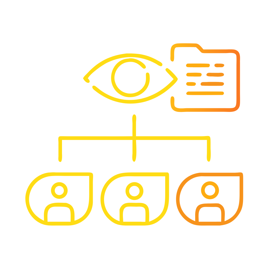
First, a metric tree was defined to connect enterprise efficiency targets to operational drivers.
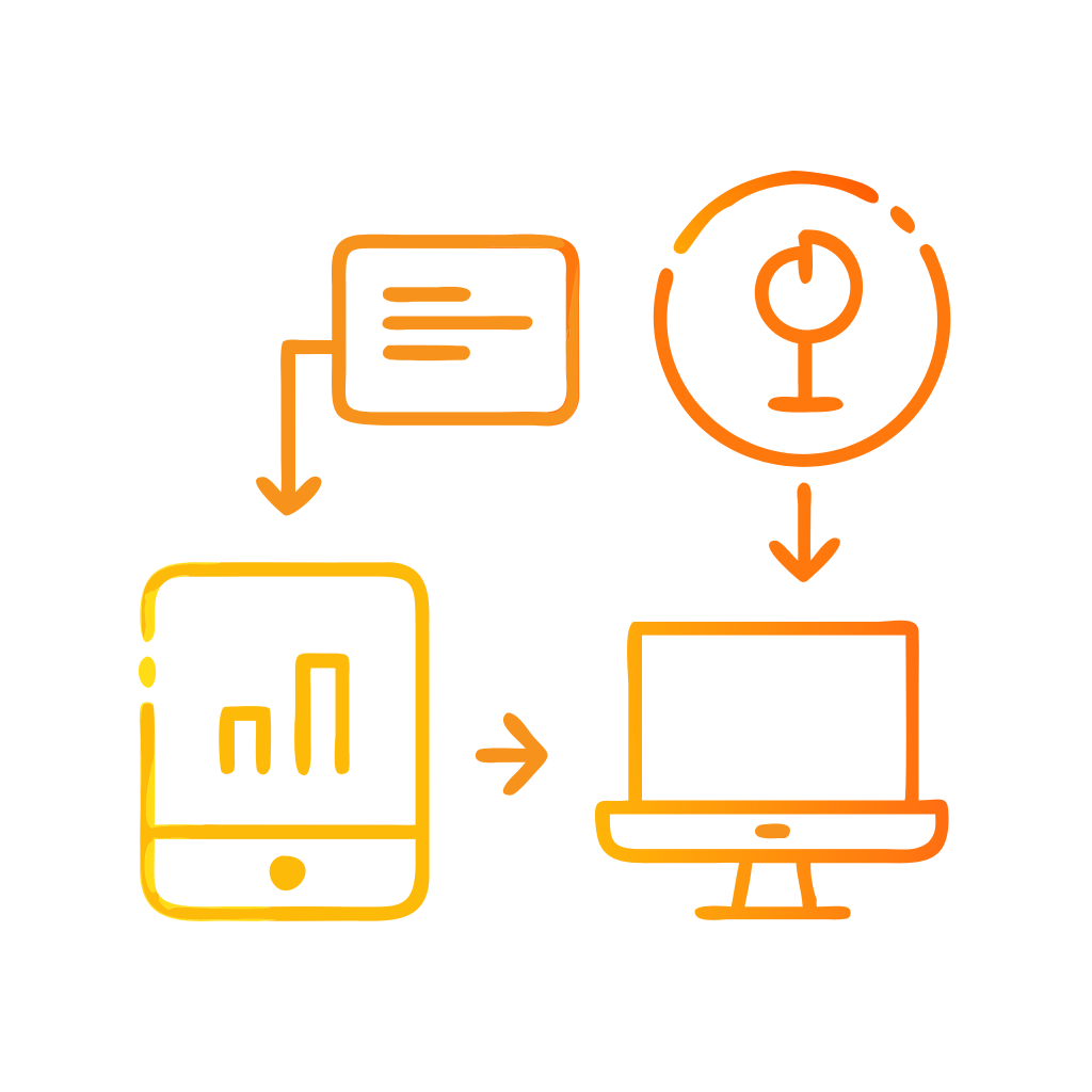
Second, dashboards were redesigned using a five-second comprehension rule for executives.
Third, governance controls ensured that all views used certified data and definitions.
Customer Science Insights was used to implement governed KPI models and value-based dashboards across operational and executive layers. This ensured consistency while enabling self-service exploration.
How did these changes drive a 20 percent efficiency gain?
The efficiency gain did not come from optimisation algorithms alone. It came from faster, clearer decisions. Managers could see which queues, processes, or behaviours were driving excess effort and act before costs accumulated.
Within six months, the organisation recorded a sustained 20 percent improvement in productivity measures, reduced rework, and more stable service levels. Independent post-implementation review confirmed that gains were attributable to decision visibility rather than demand fluctuation².
What role did governance play in sustaining results?
Governance ensured that improvements held. Metric definitions were locked. Dashboards were certified. Changes followed controlled processes.
This prevented the gradual erosion of trust that often follows BI success. Executives continued to use dashboards in performance forums because numbers remained stable and explainable. Governance transformed BI from a project into an operating capability.
How were outcomes measured and validated?
Outcomes were measured using before-and-after comparisons across matched periods. Efficiency metrics were normalised for demand and mix. Financial validation was conducted by the finance function.
This discipline aligned with guidance from ISO on performance measurement integrity³. Validation reinforced executive confidence and supported reinvestment decisions.
What can other organisations learn from this case?
The key lesson is that value must be explicit. BI succeeds when it answers executive questions in business terms. Tools enable this, but design and governance determine impact.
Organisations seeking similar results should focus on decision clarity, value-based KPIs, and disciplined visualisation before investing in advanced analytics.
Customer Science Case Evidence
Customer Science has delivered comparable outcomes across multiple sectors by applying value-led BI design:
-
A government service provider reduced cost-to-serve by over 15 percent through executive dashboard redesign and metric governance.
-
A regulated enterprise improved workforce productivity by double digits by linking operational BI to financial outcomes.
These case studies are documented on customerscience.com.au/case-study and demonstrate repeatable patterns of impact.
What are the next steps for leaders?
Leaders should assess whether current dashboards clearly express value. If not, redesign should start with executive decisions, not data availability.
Customer Science CX Consulting and Professional Services and Business Intelligence services support value-led BI transformation, from metric design through to governed implementation.
Evidentiary Layer
Customer Science case examples, product capabilities, and service descriptions referenced in this article are drawn from official Customer Science documentation and case materials.
FAQ
What does “visualising value” mean in BI?
It means expressing performance in terms of outcomes executives care about, not just operational activity.
Is a 20 percent efficiency gain realistic?
Yes, when inefficiency is visible but unmanaged. Clarity often unlocks latent improvement.
Did this require new BI tools?
No. The primary change was in design, metrics, and governance rather than tooling.
Which Customer Science products were used?
Customer Science Insights supported governed KPI models and value-based dashboards.
How long did it take to see results?
Early improvements appeared within weeks. Sustained gains were validated within six months.
Can this approach work outside contact centres?
Yes. Any operational environment with measurable effort and outcomes can benefit.
Sources
-
Gartner. Why dashboards fail to drive decisions. 2021.
-
McKinsey & Company. Performance management transformations. 2020.
-
ISO 9001:2015 Quality management systems.