


A high-impact wallboard aligns hybrid agents around a few real-time signals that directly improve customer outcomes and team wellbeing. The best designs reduce cognitive load, make performance transparent, and support coaching rather than surveillance. This article explains what to show, how to structure it, how to avoid perverse incentives, and how to measure impact with controlled, operational metrics.
What is a wallboard and what does “high-impact” mean?
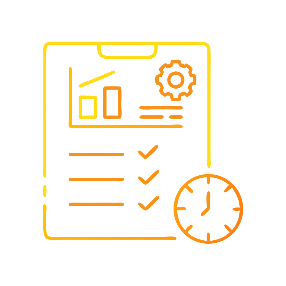
A wallboard is a shared, real-time display of operational signals that helps a contact centre coordinate work. In a hybrid model, the “wall” can be a physical screen, a virtual display shared in collaboration tools, or a lightweight personal widget. “High-impact” means the wallboard changes decisions in the moment, not just reporting what already happened.
A high-impact wallboard does three jobs. First, it creates shared situational awareness so agents and leaders can see demand, capacity, and risk at the same time. Second, it provides simple decision cues that reduce mental workload rather than adding to it, consistent with ergonomic principles for work system design¹² and mental workload concepts³. Third, it reinforces the behaviours you want, without pushing agents into counterproductive gaming or stress.
Why do hybrid agents need different wallboards than office-based teams?
Hybrid teams have less ambient awareness. In an office, agents learn queue pressure, outage impacts, and supervisor intent through overheard conversations and visible activity. Remote and blended teams lose those cues, so they rely more heavily on explicit signals. This increases the importance of clarity, cadence, and fairness in what is displayed.
Hybrid work at scale is now normal in many labour markets, including Australia where millions report working from home⁶, and global evidence shows telework adoption rose sharply during the pandemic and remains structurally higher than pre-crisis baselines⁵. At the same time, contact centres face sustained retention pressure, with Australian industry reporting attrition around 29%¹. Wallboards can either help or harm in this environment. When they are designed as supportive coordination tools, they reduce uncertainty. When they are designed as “leaderboards with a stopwatch,” they amplify stress and turnover risk.
How do wallboards work as an operational control system?
Wallboards are a control loop. They sense demand and performance, interpret signals against thresholds, trigger actions, and then show whether those actions worked. The mechanism fails when the wallboard becomes a dense dashboard. Research on dashboard information load shows that as the number of elements rises, cognitive load rises and usability can fall, especially when information is not task-aligned⁷. Studies of real-time operational dashboards also focus on how information type and presentation can influence perceived workload and task performance¹⁰.
Design the control loop around three tiers of decisions:
Immediate stabilisation: queue risk, backlog, outage flags, staffing gaps.
Short-cycle optimisation: handle time drivers, wrap time, transfer patterns, knowledge health signals.
Quality and customer outcomes: recontact risk, sentiment or complaint signals, first contact resolution trends.
Make each tier explicit, then limit what you show to what the team can act on within the tier’s time horizon.
What should a hybrid wallboard optimise for?
Optimise for customer outcomes and agent capability, not only throughput. In practice, this means prioritising measures like service level (answered within a target time) and abandonment (customers who leave the queue) as “flow” indicators, alongside resolution outcomes such as first contact resolution and recontact. Many centres still rely on industry conventions like “X% answered in Y seconds,” but definitions and targets vary by channel and customer segment. The wallboard must reflect your own service model, not generic benchmarks.
Wallboards vs dashboards vs scorecards: what is the difference?
A wallboard is for shared, in-the-moment coordination. A dashboard is for exploration and analysis. A scorecard is for performance evaluation across longer cycles. Problems happen when leaders ask one artefact to do all three.
A practical distinction is cadence and consequence:
Wallboards update continuously and drive immediate action.
Dashboards update at intervals and drive investigation.
Scorecards update weekly or monthly and drive performance conversations.
If you want performance management, use scorecards. If you want operational control, use wallboards. If you want learning, use dashboards. Mixing them increases noise and perceived surveillance, especially for hybrid agents.
What should you display on wallboards for hybrid agents?
Start with a “minimum viable wallboard” and scale only when it repeatedly drives better decisions. A reliable baseline is 10 to 14 tiles, grouped into four bands.
Band 1: Demand and flow
Show demand now, not just volume today. For voice and messaging queues, include:
Contacts waiting and longest wait
Service level progress against a clear threshold
Abandonment or drop-off rate
Use simple trend arrows or sparklines only if they remain readable at a glance.
Band 2: Capacity and coverage
Hybrid teams need shared visibility of capacity shifts:
Agents available, in-contact, and in after-call work
Staffing gap to plan (difference between required and scheduled)
Key skill group coverage (for priority customer cohorts)
Band 3: Quality and customer outcomes
Avoid scoring individuals on the main wallboard. Show team outcome signals:
First contact resolution trend (or proxy, such as 7-day recontact)
Top contact drivers (stable taxonomy)
Escalation rate trend
Band 4: Agent experience and enablement
Agent experience should be operational, not sentimental:
Knowledge health: broken articles, search failure rate, emerging topics
Coaching queue: number of interactions awaiting review, not “who failed”
Workload pacing: safe thresholds for back-to-back contacts based on your context³
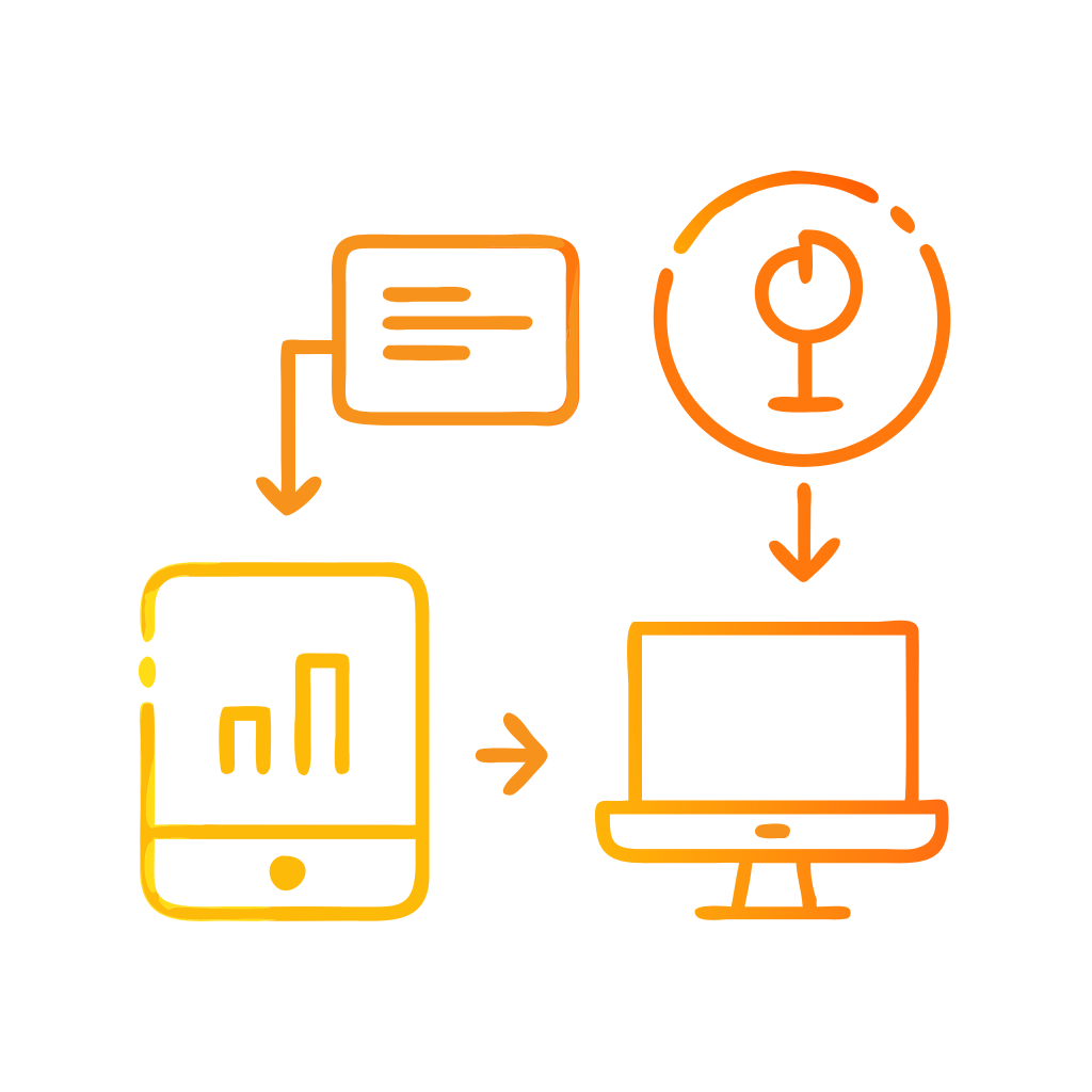
If you are using a real-time analytics layer to unify data across channels and systems, keep the wallboard as the “front end” of that layer. Customer-facing and agent-facing operational decisions improve when signals are consistent across voice and digital.
For organisations that want to operationalise real-time contact centre analytics into clear, role-based wallboards, Customer Science Insights is designed for that purpose.
How do you design wallboards that reduce cognitive load?
Cognitive load is not solved by “prettier charts.” It is solved by fewer choices, clearer meaning, and consistent visual grammar. Evidence from information overload research shows that structured visualisation can reduce time and errors while improving situational awareness⁸, but only when the design matches the task.
Apply five concrete principles:
1) Make every tile answer a single decision
A tile should trigger one action, not invite debate. If a tile requires discussion, move it to a dashboard.
2) Use stable layouts and predictable scanning
Research on visual forms suggests that certain graph orientations can improve reading efficiency in some contexts⁹. In wallboards, the broader point is stability: keep key tiles in fixed positions so teams develop “muscle memory” for scanning.
3) Enforce accessibility standards
Hybrid agents consume wallboards on different screens, lighting, and vision conditions. Follow contrast guidance aligned with WCAG 2.2, including minimum text contrast ratios⁴, and ensure non-text indicators (icons, borders, states) also meet contrast needs⁴. This improves speed and reduces misreads.
4) Separate “team health” from “individual performance”
If you display individual rankings, do it in a coaching context with consent and safeguards. Public ranking can lift short-term speed but degrade quality and psychological safety.
5) Treat thresholds as products
A threshold must be explainable, testable, and adjustable. When thresholds are arbitrary, agents disengage and leaders chase noise.
What are the main risks and how do you avoid them?
The most common failure modes are predictable and preventable.
Perverse incentives and metric gaming
If you optimise for average handle time alone, you can increase transfers, reduce empathy, and increase recontact. Balance flow metrics with outcome metrics so the wallboard cannot “reward” bad experiences.
Stress amplification and fairness concerns
In high-attrition environments¹, wallboards that feel punitive can accelerate churn. Avoid continuous individual surveillance cues. Use team-level signals on shared displays and reserve individual analytics for private coaching.
Accessibility and inclusion gaps
Non-compliant contrast and tiny typography create operational risk. Poor readability increases error rates and slows response. Use WCAG-aligned constraints⁴ as non-negotiable requirements.
Data integrity and trust
If the wallboard is wrong, it becomes worse than useless. Build confidence with clear data definitions, timestamp visibility, and an incident mode when upstream systems degrade.
How do you measure whether a wallboard is working?
Measure wallboards like an operational intervention, not a branding exercise. Start with a baseline, run a controlled rollout, and track outcomes with a short feedback loop.
A pragmatic measurement set includes:
Service level and abandonment shifts, segmented by queue and time of day
Recontact rate, or first contact resolution if measured reliably
Transfer and escalation rates
Agent after-call work time and wrap drivers
Agent retention and absence trends, especially in centres with high attrition¹
Also measure cognitive burden indirectly. When wallboards reduce cognitive load, teams often show faster stabilisation during demand spikes and fewer “manager interrupts.” Research linking information load to cognitive load in dashboards⁷˒¹⁰ supports designing for minimal, task-aligned information, then validating through operational outcomes.
For centres that want a structured measurement and continuous improvement approach, CX consulting support can help define KPI governance, data definitions, and experiment design.
What is a practical 30-60-90 day plan to implement high-impact wallboards?
Days 1 to 30: Define decisions, not metrics
Document the top 10 operational decisions your hybrid floor must make daily. Map each decision to one observable signal and one action. Define data sources and ownership. Lock accessibility constraints⁴ before visual design begins.
Days 31 to 60: Build the minimum viable wallboard and run pilots
Launch one wallboard per role: agents, team leads, and operations. Keep them different. Pilot with one queue group. Train leaders to use the wallboard for coaching and stabilisation, not blame.
Days 61 to 90: Scale with governance and evidence
Add tiles only when they change outcomes. Formalise a change control process so thresholds and definitions do not drift. Establish an incident protocol for data quality. Then scale to additional queues and channels.
Evidentiary layer: what evidence supports these design choices?
The evidence base is consistent across domains that rely on real-time operational displays. Standards on mental workload and work system ergonomics emphasise that performance and wellbeing depend on the interaction of task, technology, organisation, and individual factors³˒¹². Information visualisation and overload research shows that structured dashboards can reduce errors and improve situational awareness⁸, while studies focused on information load show that excessive elements increase cognitive load and reduce usability⁷. Operational dashboard research continues to examine how real-time information types influence workload and performance¹⁰.
Finally, teamwork display research in dynamic command contexts shows that shared displays can support performance and situation awareness, particularly when communication breaks down¹¹. Hybrid contact centres face similar breakdown risks. The implication is clear: fewer, clearer, action-linked signals improve coordination.
FAQ: designing high-impact wallboards for hybrid agents
What is the single most important wallboard rule?
Tie every element to a decision the team can make within a defined time window. If nobody can act on it, it does not belong on the wallboard.
Should we show individual agent rankings on the main wallboard?
Avoid it for hybrid teams unless you have strong safeguards. Public ranking increases perceived surveillance and can push gaming. Use private coaching views for individual performance.
How many metrics should be on a wallboard?
Start with 10 to 14 tiles. Add only when a new tile repeatedly changes behaviour and improves outcomes such as service level, abandonment, or recontact.
How do we make wallboards accessible across different home-office setups?
Use WCAG-aligned contrast and non-text indicator rules⁴, avoid tiny fonts, and test on common laptop screens in real lighting. Accessibility is an operational reliability feature, not a compliance add-on.
How can we connect wallboards to quality and brand consistency?
Use real-time quality signals and coaching queues at team level, then support agents with tools that improve knowledge and communication quality. For message and interaction scoring that supports consistent customer communications, CommScore.AI can be used as part of the enablement layer.
What outcomes should executives expect if wallboards are done well?
Faster stabilisation in peak demand, improved service level and abandonment, lower avoidable recontact, and better retention in high-attrition environments¹, supported by clearer expectations and reduced operational ambiguity.
Sources
Australian Customer Experience Professionals Association (ACXPA). 2025 Australian Contact Centre Industry Best Practice Report. (https://acxpa.com.au/2025-australian-contact-centre-industry-best-practice-report/)
International Organization for Standardization (ISO). ISO 9241-110:2020 Ergonomics of human-system interaction, Part 110: Interaction principles. (https://www.iso.org/standard/75441.html)
International Organization for Standardization (ISO). ISO 10075-1:2017 Ergonomic principles related to mental workload, Part 1: General issues and concepts. (https://www.iso.org/standard/66900.html)
World Wide Web Consortium (W3C). Web Content Accessibility Guidelines (WCAG) 2.2 (2023). (https://www.w3.org/TR/WCAG22/)
Organisation for Economic Co-operation and Development (OECD). The role of telework for productivity during and post-COVID-19 (2021). (https://www.oecd.org/content/dam/oecd/en/publications/reports/2021/12/the-role-of-telework-for-productivity-during-and-post-covid-19_dbbfb20e/7fe47de2-en.pdf)
Roy Morgan. More than 6.7 million Australians work from home (2025). (https://www.roymorgan.com/findings/9981-work-from-home-june-2025)
Ke, J. et al. Effect of information load and cognitive style on cognitive load of visualized dashboards (2023). doi:10.1016/j.dss.2023.113??? (ScienceDirect landing page: https://www.sciencedirect.com/)
Arnold, M. et al. Dealing with information overload: a comprehensive review (2023). (https://pmc.ncbi.nlm.nih.gov/articles/PMC10322198/)
Liu, Y. et al. The effects of dashboard design form on driving performance and cognitive load (2025). doi:10.3389/fpsyg.2025.1635951 (https://www.frontiersin.org/journals/psychology/articles/10.3389/fpsyg.2025.1635951/full)
Stahmann, P. et al. Advanced analytics in real-time operational dashboards: effects on cognitive and task load (2025). doi:10.1080/12460125.2025.2593245 (https://www.tandfonline.com/doi/full/10.1080/12460125.2025.2593245)
Parush, A. et al. Team displays work: performance and situation awareness in simulated command tasks (2012). doi:10.1177/1071181312561087 (https://journals.sagepub.com/doi/10.1177/1071181312561087)
International Organization for Standardization (ISO). ISO 6385 Ergonomics principles in the design of work systems (latest edition). (https://www.iso.org/standard/63787.html)